Views: 63
In previous post, we have learned how to devlelop a custom Gutenberg block using ES5 syntax. We have developed a custom Gutenberg block which adds colored lines in Post/Page content. The block developed in previous post is not customize-able. In this tutorial we will learn how to change the appearance of the colored lines using block controls and attributes.
Please visit the previous blog post to continue on this blog post.
Block Controls – Gutenberg Block Development
Block controls are used to customize the appearance of the Gutenberg blocks. WordPress provides two type of block controls i.e Block Toolbar and Settings Sidebar. Now we will use Block Toolbar to add new block control i.e AlignmentToolbar which will allow us to change the alignment (left, center, right) of the colored lines and will save the setting in block attributes object.
Block Attributes
The block attributes are actually the placeholders to save the customized settings. Following code example will further elaborate the concept and usage of the block attributes.
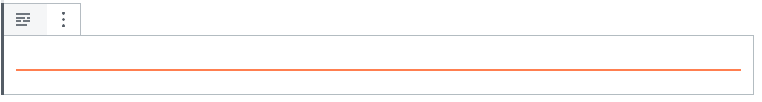
Block Toolbar
Block Toolbar appears when we add/click inside the Gutenberg block. It gives the customization options to change the appearance of the block. The colored lines block, we have developed in previous post includes the default Block Toolbar as shown below. Now we will add a block control for the alignment (left, center, right) of the colored line.
Alignment Toolbar
Alignment Toolbar when added in the Block Toolbar will show the options to align (left, center, right) the colored line. First of all we need to import the BlockControls and AlignmentToolbar elements from the editor package as follows:
const {BlockControls, AlignmentToolbar} = editor;Then we will update the attributes and example objects to include a new attribute i.e alignment with data type of sting and default value of left.
attributes: {
	alignment: {
		type: 'string',
		default: 'left',
	},
},
example: { // used to define default values for the attributes
	attributes: {
		alignment: 'left',
	},
},
Now at the start of the edit() function we will add a new function will be called when the value of alignment is changed and will update the alignment attribute with the updated one.
const onChangeAlignment = ( newAlignment ) => {
	props.setAttributes( { alignment: newAlignment === undefined ? 'left' : newAlignment } );
};
Now we will update our blockInnerStyle object inside edit() function and save() function to have a new style for alignment.
const blockParentStyle = {
	width: '100%',
	padding: '0',
	marginTop: '0px',
	marginBottom: '0px',
        textAlign: props.attributes.alignment,
};
Now inside the return array of edit function we will add the BlockControl element with AlignmentToolbar as follows:
el(
     BlockControls,
     { key: 'controls' },
      el(
          AlignmentToolbar,
          {
              value: props.attributes.alignment,
              onChange: onChangeAlignment,
          },
       )
),
Complete Code
Following is the updated and complete code of block.js file to add a new Alignment Toolbar control.
( function(blocks, editor, element) {
	const __ = wp.i18n.__; // The __() for internationalization.
	const el = element.createElement; // The wp.element.createElement() function to create elements.
	const registerBlockType = blocks.registerBlockType; // The registerBlockType() to register blocks.
	const {BlockControls, AlignmentToolbar} = editor;

	registerBlockType( 'customwpblock/colored-lines', { // Block name. Block names must be string that contains a namespace prefix. Example: my-plugin/my-custom-block.
		title: __( 'Colored Lines', 'customwpblock' ), // Block title.
		icon: 'text', // Block icon from Dashicons → https://developer.wordpress.org/resource/dashicons/.
		category: 'common', // Block category — Group blocks together based on common traits E.g. common, formatting, layout widgets, embed.
		keywords: [ 'customwpblock', 'colored', 'lines' ], // keywords for custom block
		attributes: {
			alignment: {
				type: 'string',
				default: 'left',
			},
		}, //placeholders to store customized settings information about the block
		example: { // used to define default values for the attributes
			attributes: {
				alignment: 'left',
			},
		},
		// The "edit" property must be a valid function.
		edit: (function( props ) {
			const onChangeAlignment = ( newAlignment ) => {
				props.setAttributes( { alignment: newAlignment === undefined ? 'left' : newAlignment } );
			};

			const blockParentStyle = {
				width: '100%',
				padding: '0',
				marginTop: '0px',
				marginBottom: '0px',
			    textAlign: props.attributes.alignment,
			};
			const blockInnerStyle = {
				backgroundColor: "#FF7F50",
				width: '100%',
				height: '2px',
				display: 'inline-block',
			};

			return [
				el(
				     BlockControls,
				     { key: 'controls' },
				      el(
				          AlignmentToolbar,
				          {
				              value: props.attributes.alignment,
				              onChange: onChangeAlignment,
				          },
				       )
				),
				el( 'div', { className: props.className },
					el( 'div', { className: 'customwpblock-colored-lines', style : blockParentStyle },
						el( 'span', {style : blockInnerStyle},
						)
					)
				)
			];
		}),

		// The "save" property must be specified and must be a valid function.
		save: function( props ) {

			const blockParentStyle = {
				width: '100%',
				padding: '0',
				marginTop: '0px',
				marginBottom: '0px',
			    textAlign: props.attributes.alignment,
			};
			const blockInnerStyle = {
				backgroundColor: "#FF7F50",
				width: '100%',
				height: '2px',
				display: 'inline-block',
			};
			return (
				el( 'div', { className: props.className }, // className property is automatically enabled for each block
					el( 'div', { className: 'customwpblock-colored-lines', style : blockParentStyle },
						el( 'span', {style : blockInnerStyle},
						)
					)
				)
			);
		},
	} );
})(window.wp.blocks,
    window.wp.editor,
	window.wp.element
);
Now you will be able change the alignment of the colored lines but for now they will not be visible because the colored lines are covering the 100% available width. In next tutorial when we will make the width of the colored lines dynamic then you will be able to see the alignment effect in action.
Output

Conclusion and Further Steps
In this tutorial blog post, we have added a new Block Control in Block Toolbar to change the alignment of the colored lines block. In next tutorial, we will use Settings Sidebar to add the options to change the width and height of the colored lines.